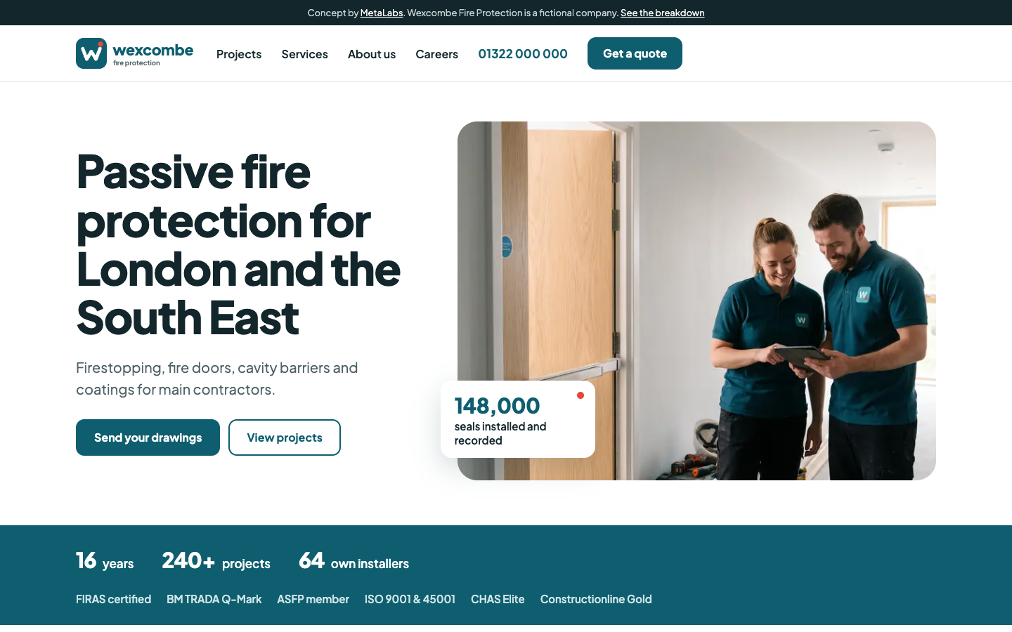
The Brief
Wexcombe Fire Protection is a made-up passive fire protection subcontractor in Dartford, working for main contractors across London and the South East. Its brand and website are a concept, built to show what a specialist subcontractor's site can look like when it's designed around how main contractors choose their supply chain.
The buyer is a package manager or estimator, not the end client. They check accreditations, project values, capacity and safety before adding you to a tender list. Since the Building Safety Act, anyone buying fire protection for a higher-risk building also needs proof that every seal was fitted to a tested detail.
Most UK fire protection sites use a generic template with icons on every card and long blocks of text. So the brief was: a real brand, a photo in every section, very little text, and one piece of interface that shows the evidence instead of describing it.
The Brand
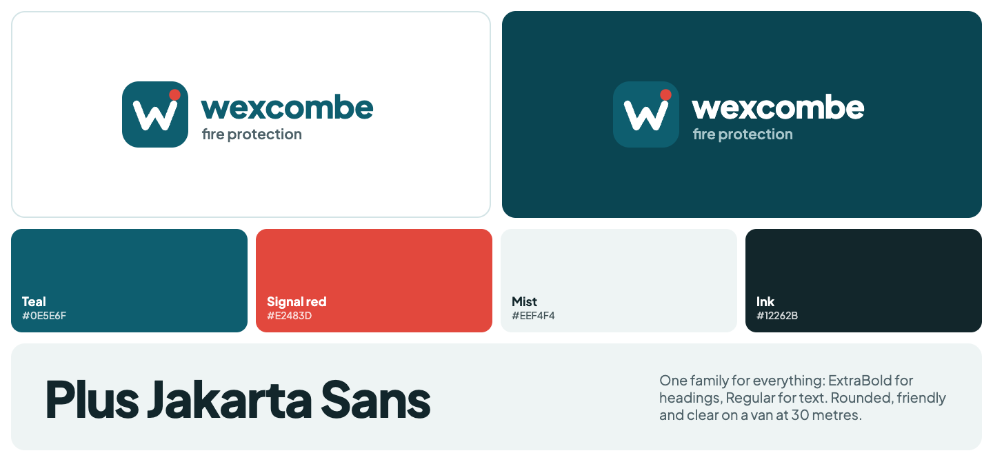
- Logo: a teal rounded square with a white "w" and a red dot, next to the name in lowercase. It works small on a polo shirt and large on a van. Download the logo or the mark (SVG).
- Colours: teal #0E5E6F, signal red #E2483D for small accents, mist #EEF4F4 for backgrounds and ink #12262B for text.
- Type: Plus Jakarta Sans throughout: ExtraBold for headings, Regular for text.
- In the photos: the logo appears on polos, vests and vans, so the brand shows up on site, not just on the website.
1. Say What You Do and Where
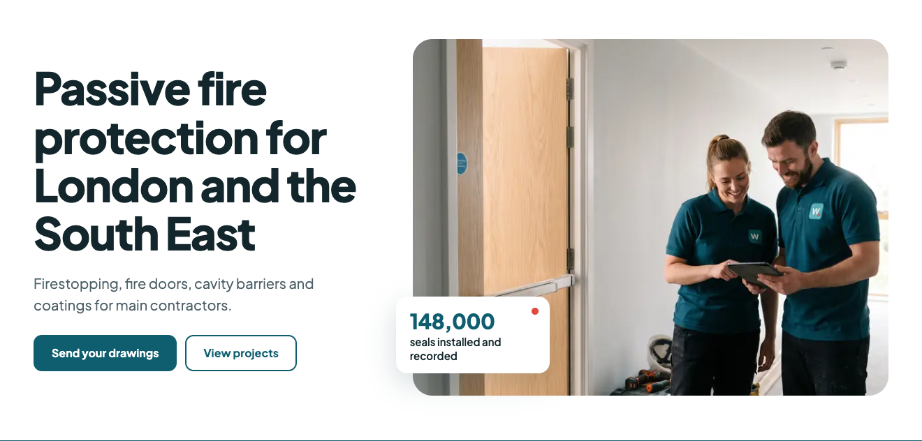
What it does: One headline with the trade and the area, one line naming the services and the buyer, and two buttons: Send your drawings and View projects. The photo shows the team in branded kit next to a finished fire door.
Why it matters: A package manager with a tender list needs to know in seconds whether you do their package in their area. Branded people on a real job say "this is an established firm" faster than any slogan.
2. Put the Proof in One Strip

What it does: Three numbers (years, projects, own installers) and the schemes as plain text: FIRAS, BM TRADA Q-Mark, ASFP, ISO, CHAS and Constructionline.
Why it matters: Main contractors pre-qualify their supply chain, and third-party certification is near the top of the checklist for fire protection. Text scans faster than a row of logos and loads instantly.
3. Projects With a Sector Filter
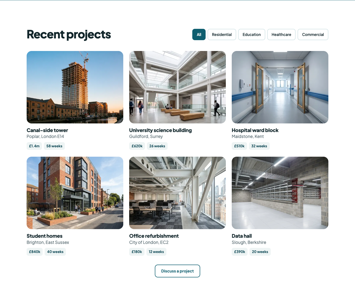
What it does: Project cards with only a photo, the name, the location, the value and the programme. Filter buttons sort them by sector, so the sectors section and the projects are one thing.
Why it matters: A buyer wants to see a job like theirs. Value and programme answer "can they handle our size?" without reading a case study.
4. The Signature: Every Seal, Pinned
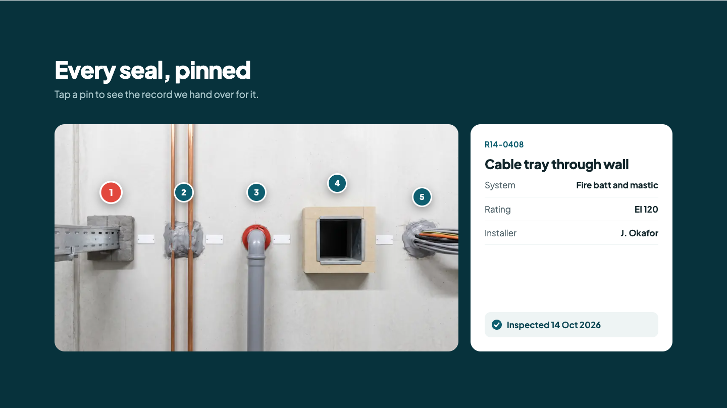
What it does: A photo of a riser with five numbered pins. Tap one and the card shows that seal's record: ID, system, fire rating, installer and inspection date.
Why it matters: Since the Building Safety Act, main contractors on higher-risk buildings need evidence for every seal. Every fire firm says it's compliant. This shows what the evidence looks like, in one tap.
5. Services as Tabs, Each With a Photo
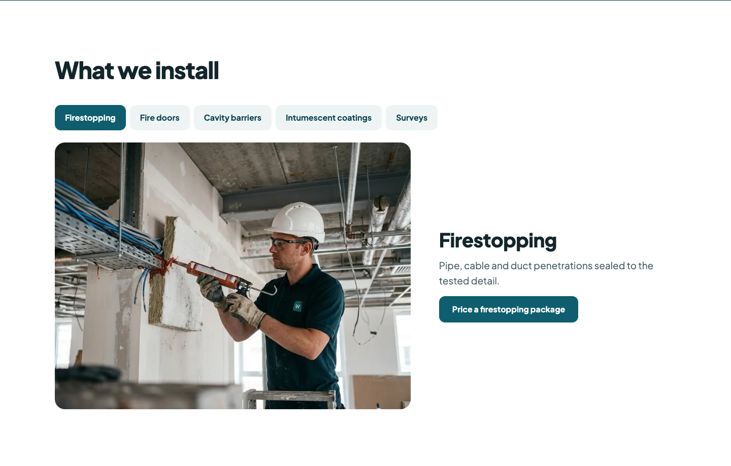
What it does: One tab per service. Each has a big photo of the work, one line and a button to price that package.
Why it matters: Estimators look for their package by name. Tabs keep the page short while still giving each service its own photo and its own action.
6. Four Steps, Not Four Paragraphs
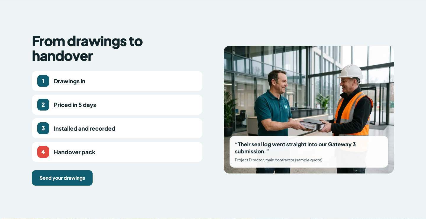
What it does: Drawings in, priced in 5 days, installed and recorded, handover pack. A photo carries a short sample quote from a main contractor.
Why it matters: The two questions on every tender are how fast you can price it and what you hand over at the end. Four short steps answer both.
7. Show the People, Then the Numbers
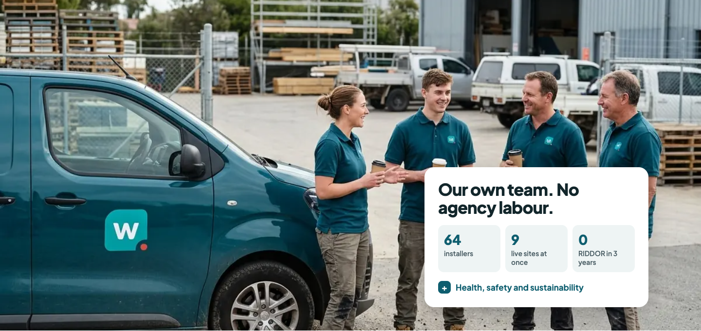
What it does: A full-width team photo with a card on top: own installers, live sites at once and RIDDOR record. Health, safety and sustainability details sit behind a toggle.
Why it matters: Main contractors worry about agency labour and overstretched subcontractors. Capacity and safety as three numbers answer that; the detail is there for whoever fills in the questionnaire.
8. Careers on the Home Page

What it does: A training photo, one line on what new starters get, and the open roles behind a toggle.
Why it matters: For most specialist subcontractors, trained people limit growth more than work does. The site that wins packages should also help hire the installers to deliver them.
9. A Quote Form Built Around Drawings
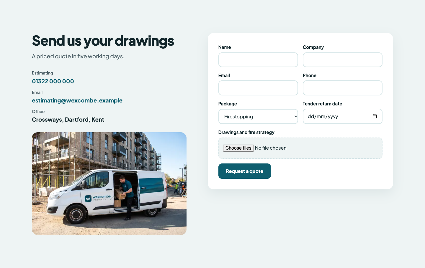
What it does: Estimating contacts, then a form asking for the package, the tender return date and the drawings.
Why it matters: Estimators want a price, not a callback. Asking for the drawings and the return date means the first reply can be a quote.
10. Built for the Phone First
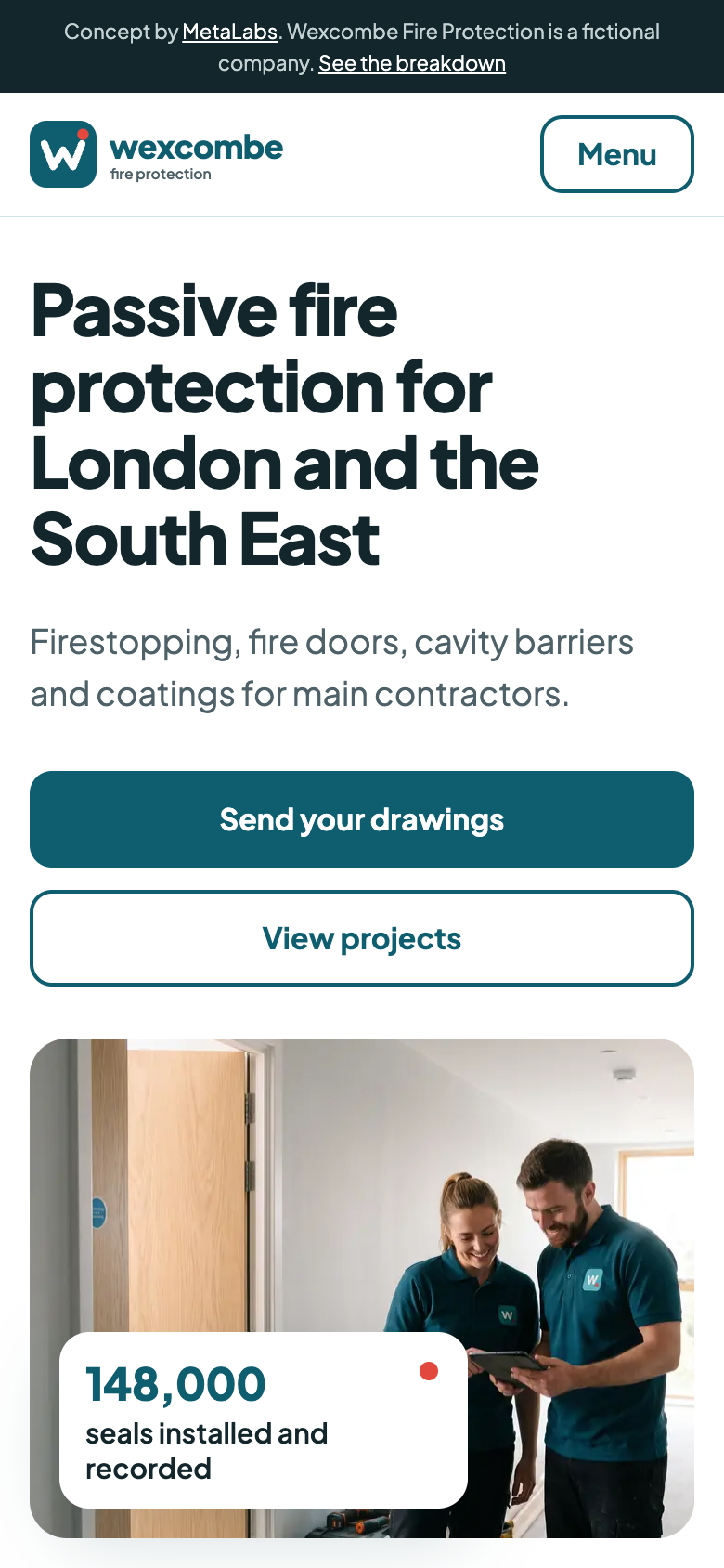
What it does: The same page on a phone: the buttons go full width, the filters and tabs scroll sideways and the pins stay tappable.
Why it matters: Site managers and package managers check subcontractors from their phones, on site or between meetings.
How Fast and Secure It Is
The live concept was tested with Lighthouse, the tool behind Google's PageSpeed Insights, on its standard phone settings: 100 for performance, accessibility and best practices, with the main photo loading in under 2 seconds and no layout shift.
Like the first concept, it's a static site served from Cloudflare's network: no WordPress, no plugins and no admin login for bots to guess.
What Its LinkedIn Could Look Like
Package managers, estimators and site managers are already on LinkedIn. Here are three carousels in the Wexcombe brand and a plan for the first month.
Carousel 1: What a Gateway 3 Firestopping Pack Needs
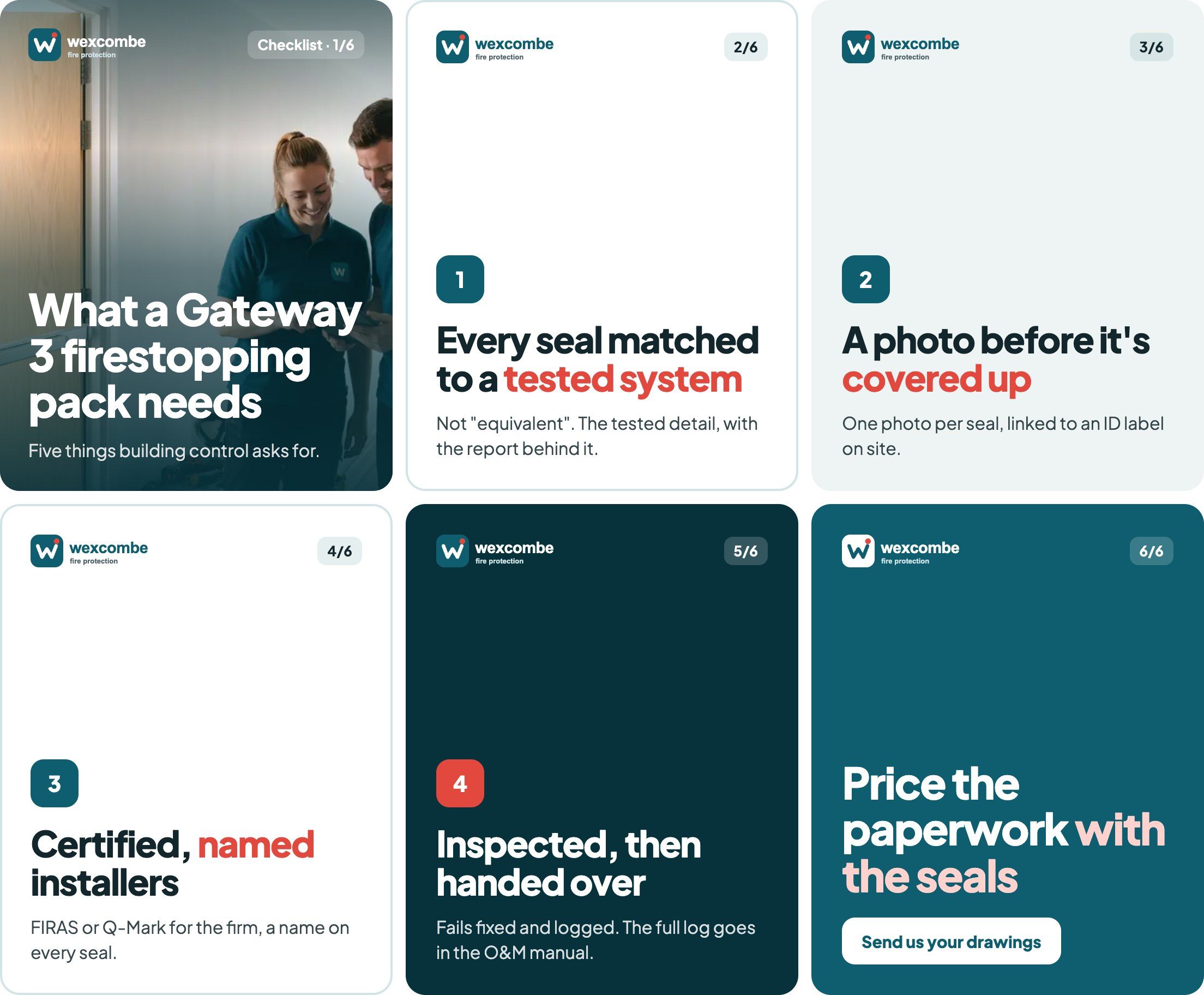
Why this one: A checklist package managers save and forward. It speaks to their biggest worry on high-rise jobs and makes the case for Wexcombe's records without a sales pitch.
Carousel 2: A Project in Six Slides
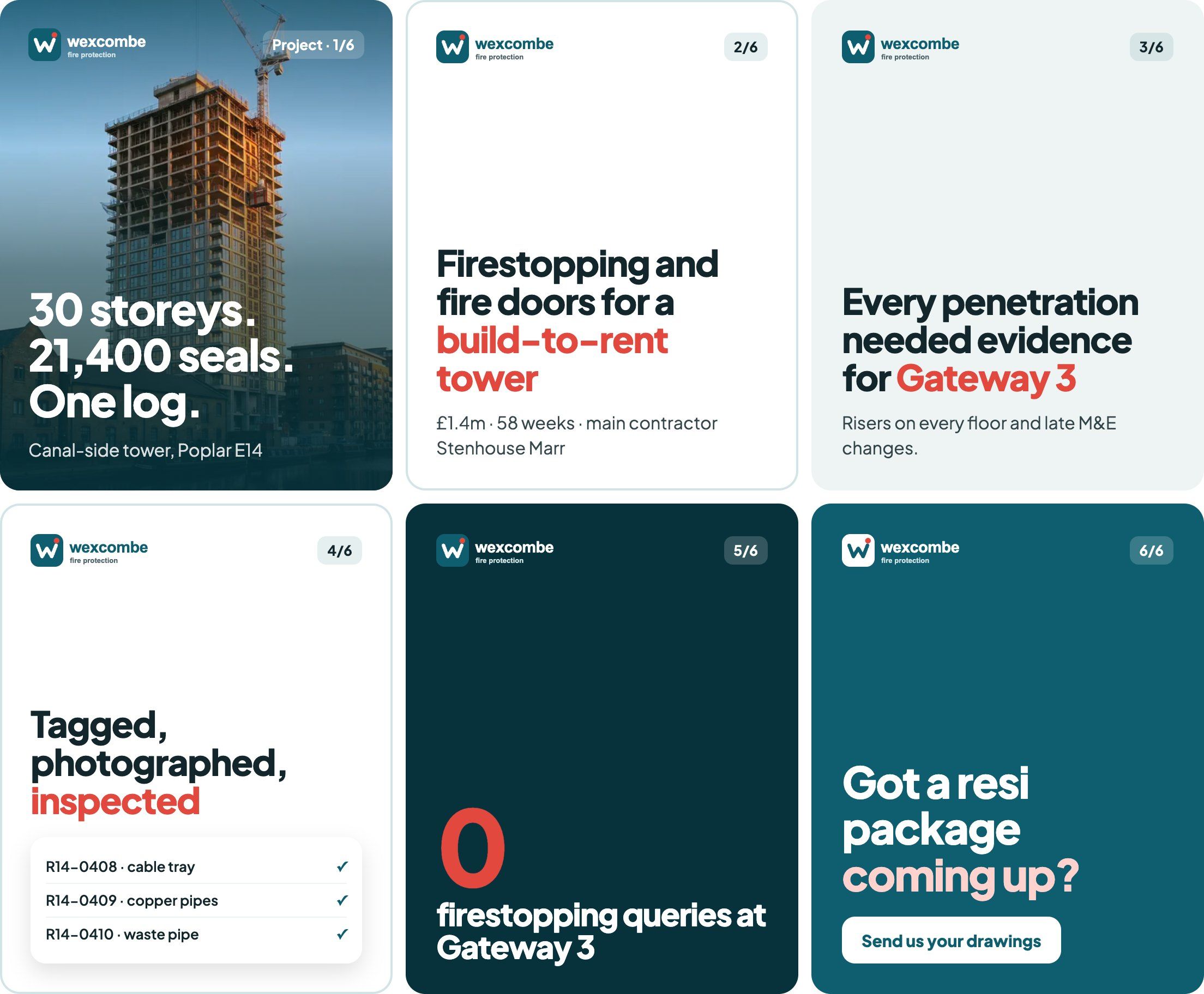
Why this one: The project cut down to what a package manager cares about: size, main contractor, value, programme and how it went at Gateway 3.
Carousel 3: Four Firestopping Mistakes
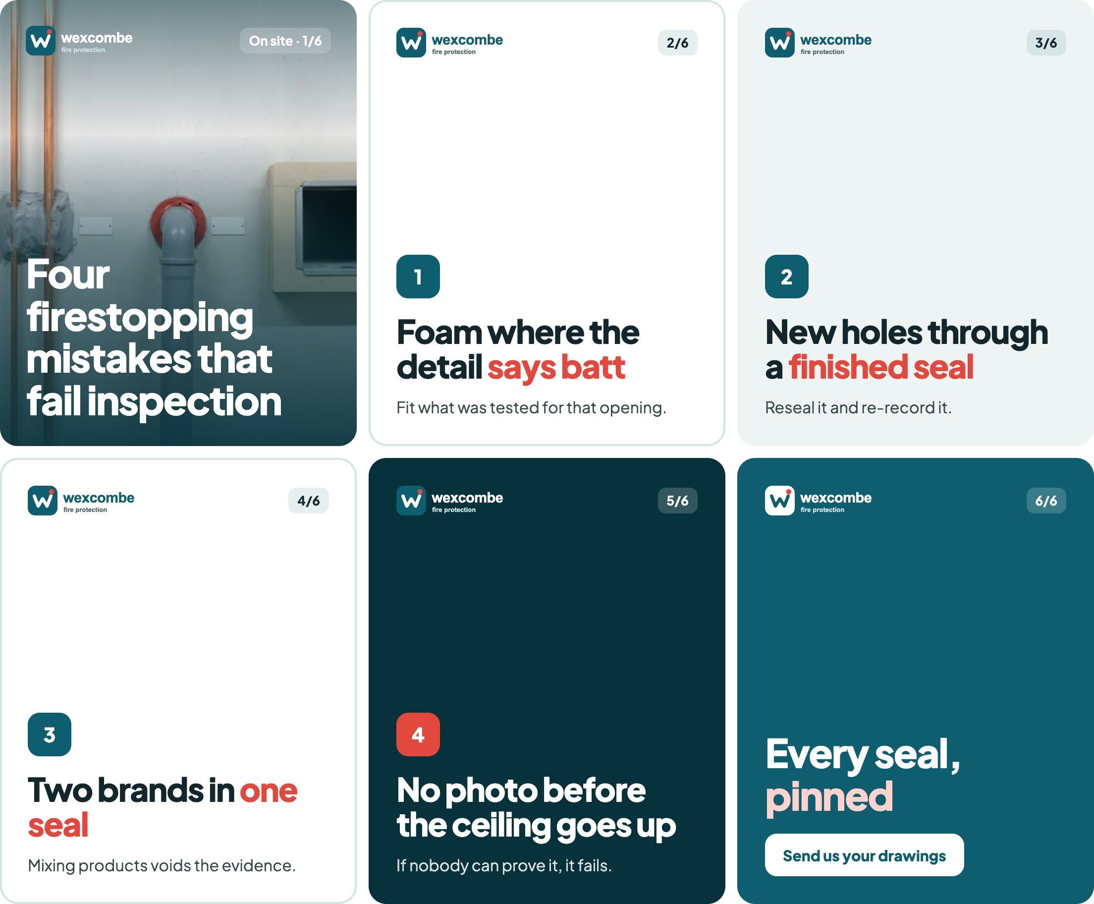
Why this one: Practical advice for site managers and M&E managers as well as package managers. It shows the firm knows the job.
The First Four Weeks
Two posts a week: a carousel on Tuesday and something from site on Thursday. The directors and supervisors reshare from their own profiles.
- Week 1: carousel 1 (the Gateway 3 checklist) on Tuesday, then a photo of a finished seal with its ID label on Thursday.
- Week 2: carousel 2 (the Poplar tower) on Tuesday, then a 30-second video of a supervisor walking a riser on Thursday.
- Week 3: carousel 3 (four firestopping mistakes) on Tuesday, then a careers post from the apprentice training day on Thursday.
- Week 4: the month in numbers: seals recorded and inspected on Tuesday, then a capacity post for estimators: when the next packages can start on Thursday.
What Every Subcontractor Website Should Include
- Your trade and your area in the first line, with a quote button
- Accreditations as text, near the top
- Projects with location, value and programme
- Services named the way tenders name them
- Proof of how you work, shown rather than described
- Capacity and safety as numbers
- Careers, because trained people limit growth
- A quote form that takes drawings and a tender return date
For real UK examples and the full checklist for construction firms, see Construction Website Design: UK Examples and What They Get Right. For a fit-out firm's version, see the first concept, Hollis Yard.
Wexcombe Fire Protection is fictional, and so are the main contractors named on its site. All names, figures, accreditations and quotes on the concept site and in the carousels are illustrative, and the photos are AI-generated.